Scroll through almost any strong brand today and something is moving. A logo that draws itself in. A button that reacts when you hover. A product shot that breathes instead of sitting still. Tampa Bay brands are adding motion for a simple reason. It holds attention, and attention is the thing every business is fighting for right now.
What motion design actually covers
Motion design is not just flashy animation on a homepage. It is a broad craft that spans a lot of touchpoints most people never stop to name. An animated logo that plays before a video. A loading state that keeps someone patient instead of frustrated. Micro-interactions on a website, like a form field that gently confirms you got it right. Short social clips where type and shapes move to a beat. Explainer videos that turn a dry service into something a customer can follow in thirty seconds.
The common thread is time. Static design controls space, where things sit on a page. Motion design adds a second layer, which is what happens across a few seconds. That extra dimension is where a lot of feeling lives. Done well, it makes a brand feel alive and considered. Done badly, it makes a site feel slow and gimmicky. The difference is intent.
Why Tampa brands are leaning into it now
A few things lined up at once. Phones got fast enough to render smooth animation without draining a battery. Social platforms started rewarding video and motion in the feed, so still images quietly lost reach. And customers got pickier. A polished, moving brand now reads as a signal that a company is current and serious about how it presents itself.
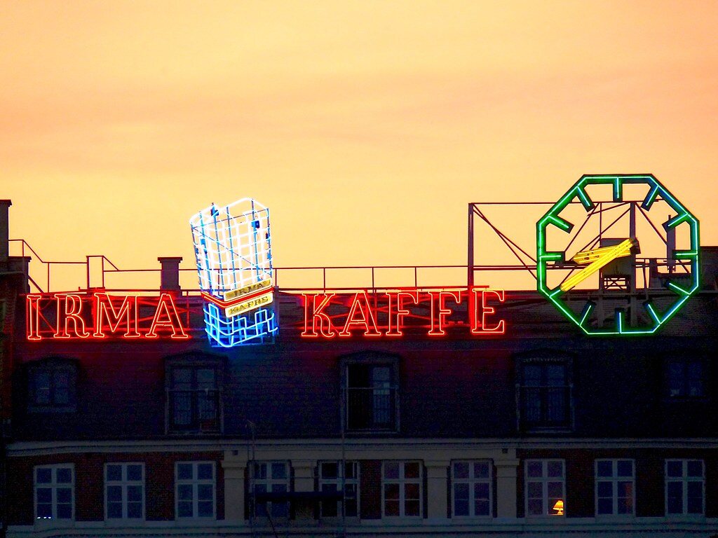
There is a local angle too. Tampa Bay is crowded with growing businesses, from St. Petersburg studios to Clearwater shops to Sarasota storefronts. When ten companies offer roughly the same service, the one that feels more modern often wins the first click. Motion is one of the fastest ways to feel modern without changing your whole identity.
Motion is not decoration. It is body language for your brand, and people read it in the first second.
It guides the eye
Good motion tells people where to look and in what order. A headline that arrives first, then a subhead, then a button, walks a visitor through a message without them realizing they are being led. That is not a trick. It is a way of respecting someone's attention by making the path obvious.
It explains hard things fast
Some products are tricky to describe in a sentence. A short animated explainer can show how something works in the time it takes to read a paragraph. For a Tampa startup pitching a new idea, that clarity can be the difference between a confused prospect and a curious one.
Where motion pays off, and where it does not
Motion is a tool, not a requirement. The goal is to use it where it earns its keep and skip it where it just adds noise. A few places where it tends to work:
- Hero sections, where a subtle moving element can pull a visitor in without slowing the page.
- Logos and brand stings, especially for video intros, reels, and event screens.
- Product demos, where showing beats telling.
- Micro-interactions on buttons, menus, and forms that make a site feel responsive and cared for.
- Social content, where movement in the first frame is often what stops the scroll.
And a few places to be careful. Text you actually need people to read should not bounce around while they try to read it. Animation that blocks someone from clicking, or that replays every single time, gets old fast. And heavy effects that tank your load time will cost you more in lost visitors than you gain in polish. Speed and motion have to be balanced, not traded.
How to add motion without wrecking performance
This is where a lot of brands trip. They fall in love with an effect, then watch their site crawl on a phone. The fix is discipline. Use lightweight formats and modern web techniques instead of giant video files where you do not need them. Lean on CSS and SVG animation for small interface moments, since they are fast and crisp. Save the heavier, rendered stuff for places where it truly adds value, like a hero video or an explainer.
It also helps to respect the viewer. Some people prefer reduced motion for comfort or accessibility reasons, and a well-built site honors that setting automatically. Motion should never come at the cost of someone being able to use your site. At Spread Media we build brand, web, and motion under one roof, which means the animation and the code are designed together rather than bolted on at the end. That is usually what keeps a site both lively and quick.
Start small and specific
You do not need to animate everything on day one. Pick one or two high-impact moments. An animated logo for your videos. A hero that moves just enough to feel alive. A handful of clean micro-interactions on your main pages. Get those right, measure how people respond, then expand. A focused start almost always beats a flashy one that nobody had time to polish.
The bottom line
Motion design is not a trend Tampa brands are chasing for the sake of it. It is a practical way to hold attention, guide people through a message, and signal that your business is current. Used with intent, and built with performance in mind, it makes a brand feel modern without asking customers to work any harder. Start with a few meaningful moments, keep the page fast, and let the movement do a specific job. If you want a partner who handles the design and the build together, take a look at what we cover on our journal and reach out when you are ready to make your brand move.